no. 11 — Creative Direction: Travel industry gridlock
my love-hate relationship with hotel content
Hi! I’ve been thinking about how to add some structure to this newsletter while remaining devoutly anti-niche. So I’m testing out a few recurring but distinct “series” of posts. Together they’ll all still look at interdisciplinary patterns shaping design, culture, and business, but each series will approach it from its own angle.
First up: Creative Direction — a series tracing emerging themes in visual and brand direction. Today I’m writing about my love-hate relationship with hotel content; in the past, I’ve shared my Copenhagen mood board; in the future, it might be on the evolution of uniforms or an edit of excellent packaging. Get it? Same but different.
More on other series to come, but I’m pretty excited about a few posts in my drafts folder rn, including a review of my Lineup dinner with Ali Ghriskey, some hot takes on discovery and “the algorithm,” and a look at what gets lost and found in language translation. Sooo…
The love part of this relationship
If you know me, you know I eventually want to own and operate my own boutique hotel. Hotels are the physical manifestation of everything I love — food, discovery, design, culture, storytelling, business strategy and operations.
Growing up my family rarely went on vacation, but that just made any night we spent away from home more riveting. The best was when my parents would spontaneously decide to drive to the beach for a night. My mom would quickly pack up a cooler with dinner and breakfast for the next morning, then we’d all hop in our blue ‘93 Nissan Quest and hit the road for a few hours until we could see the ocean. We didn’t book anything in advance; we’d just drive from motel to motel, eyes peeled for a vacancy sign. And then we’d often end up having to ask at the no vacancy ones too.
Once we found a place to spend the night, my brother and I would go into a battle royale over the room key, fighting for the chance to set eyes on our room first, even if it was only for a split second before everyone else. Then we’d both sprint as fast as our little legs would take us, up flights of stairs and around whatever obstacles to get to our room, at which point the victor would get to open sesame.
Traveling abroad as an adult has added so many layers to my love for hotels, but I feel that same thrill opening the door of every hotel room I stay in for the first time.
Travel industry gridlock
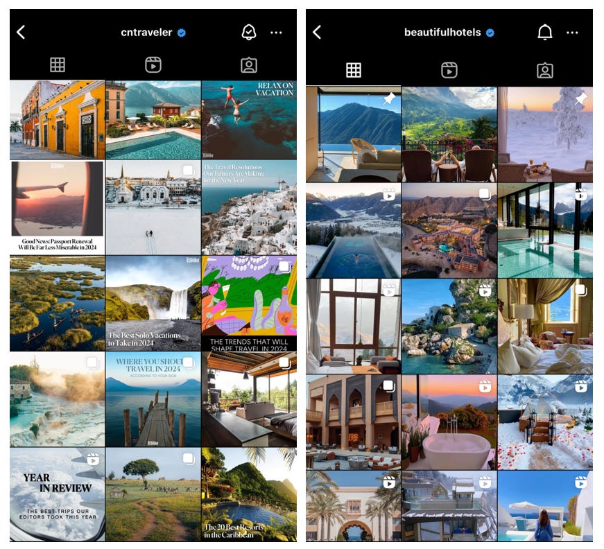
Against that backdrop, I can’t help but find most travel content these days woefully underwhelming. I follow social media in this industry pretty closely, and I can’t tell you how many top travel account grids just look like page 1 Google search results for “wanderlust.”
Tibi’s
mentioned this recently, but I think we’ve been gravitating towards more raw, up close and personal content. So landing on the travel grids above feels like scrolling back to really old posts you’ve thought about archiving.Travel is among the most complex, humanizing experiences, and yet here we’re just given tons of highly-edited images of pools and cliché airplane windows. While some of the photos are beautiful in isolation, the compound effect of each image detracts from the value of the other similar ones before it. So it’s a content and composition issue. I’m just surprised that so many of the largest brands in travel, an industry that is designed to be aspirational, aren’t thinking about it this way.
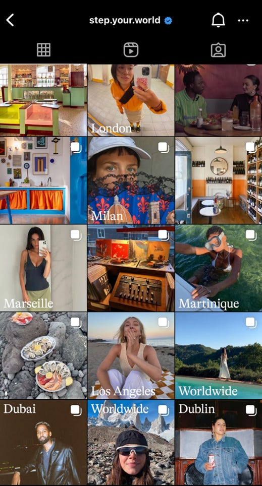
You could argue this is inevitable for pages like @cntraveler or @beautifulhotels that aggregate content globally across brands, but I say no excuse! Step, for example, does a nice job of tying together really different human stories with a cohesive and engaging brand identity. SO, lots of untapped potential for social media in travel.
What makes a good grid?
Users spend fewer than three seconds reviewing an account’s grid before deciding whether or not to hit the follow button. And data suggests they’ve already numbed their brains scrolling before that point (Americans spend a terrifying 7.5 hours on screens daily). Like effective mood boards, engaging hotel grids contain images that are beautiful individually, and then collectively convey a more multidimensional idea of a place:
Composition: There’s variety in perspective and content, as well as balance throughout the configuration. You’re given room to breathe around the more detailed photos.
Context: I like pages that aren’t so literal. Tell me you’re a hotel without telling me you’re a hotel. An insane amount of thought goes into hotel concept development, and I enjoy seeing those narrative elements unfold across its grid: niche design elements, menu inspiration, cultural context, or the history of the building before it became a hotel, etc.
Cohesion: This may be a cohesive color scheme, typeface, layout, etc. That’s why the first slide of a carousel (which pins to grid) is so important.
Here are two hotel accounts I like a lot, a lot: Ash and Hotel Corazon.
Ash is a hotelier to watch. They’re bringing high-design luxury hotels to historic buildings in tertiary cities (think Detroit, Providence, Baltimore), and effectively modernizing old world charm. There are a lot of smart things happening here that I’d love to talk to them about, but let’s stay focused on the grid for now. Here’s what I like about the narrative context: the use of film scene references to tie back to their brand identity as a builder of “cinematic monuments,” the yellow Karen Jerzyk photograph which evokes this whimsical idea of a hotel suite in a literary rather than literal way, and featuring sophisticated yet cheeky merch like this “Ash—tray” and caviar spoon which help build a persona around the Ash guest. And of course, tons of visual variation in perspective and composition which allows you to take this all in slowly.
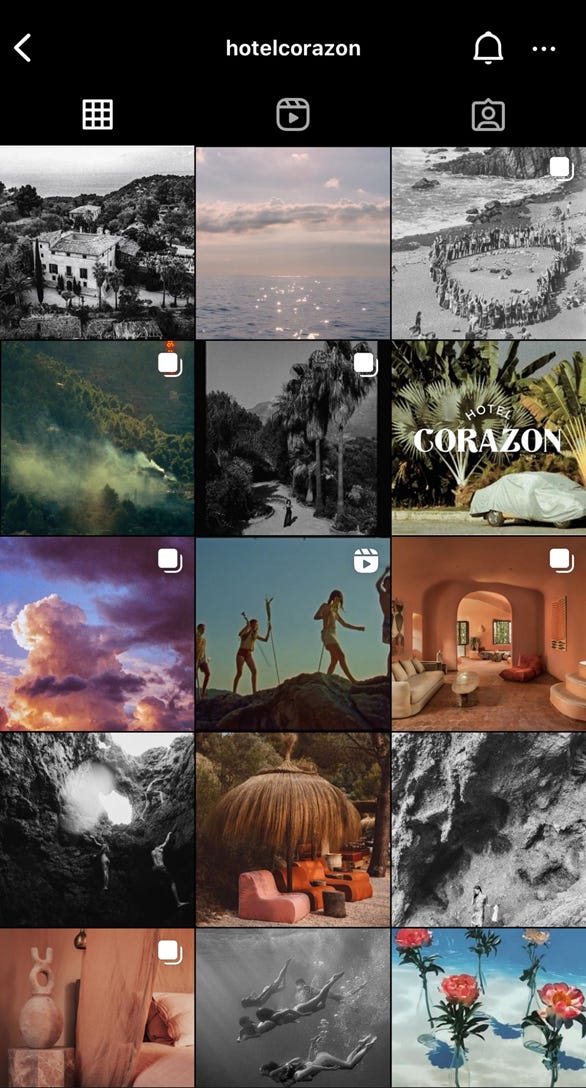
Hotel Corazon (reopening in Mallorca in March) is a 15-room hotel, restaurant, farm and shop that’s run by artists, for artists. What I like within the block above: three photos that tease elements of the plush interior design (sidenote: how do we feel about peach fuzz being pantone color of the year?!), enough semi-nude bodies to tell me this is a hotel for hot people, and a mix of black & white and somewhat grainy photography that paints a layer of nostalgic ethereality over the whole brand. I also love the film in the center, a music video that the hotel’s owner / photographer Kate Bellm shot on property for Nick Mulvey.
I’ve found some other hotel pages work because their brands act like mirrors to the cities they’re based in. Public Hotels in NYC and Trunk Hotel in Tokyo are good examples that clearly and beautifully convey distinct local moods and the energy of your stay. (I mean look at Trunk’s fabric ‘do not disturb’ hanger!) They balance the visual elements of composition and cohesion much like Ash and Hotel Corazon, but the narrative contexts here take each in very different directions.
Some side-by-side analysis
Just look at the new Fifth Avenue Hotel or any recent Martin Brudnizki project to see that maximalism is alive and well.
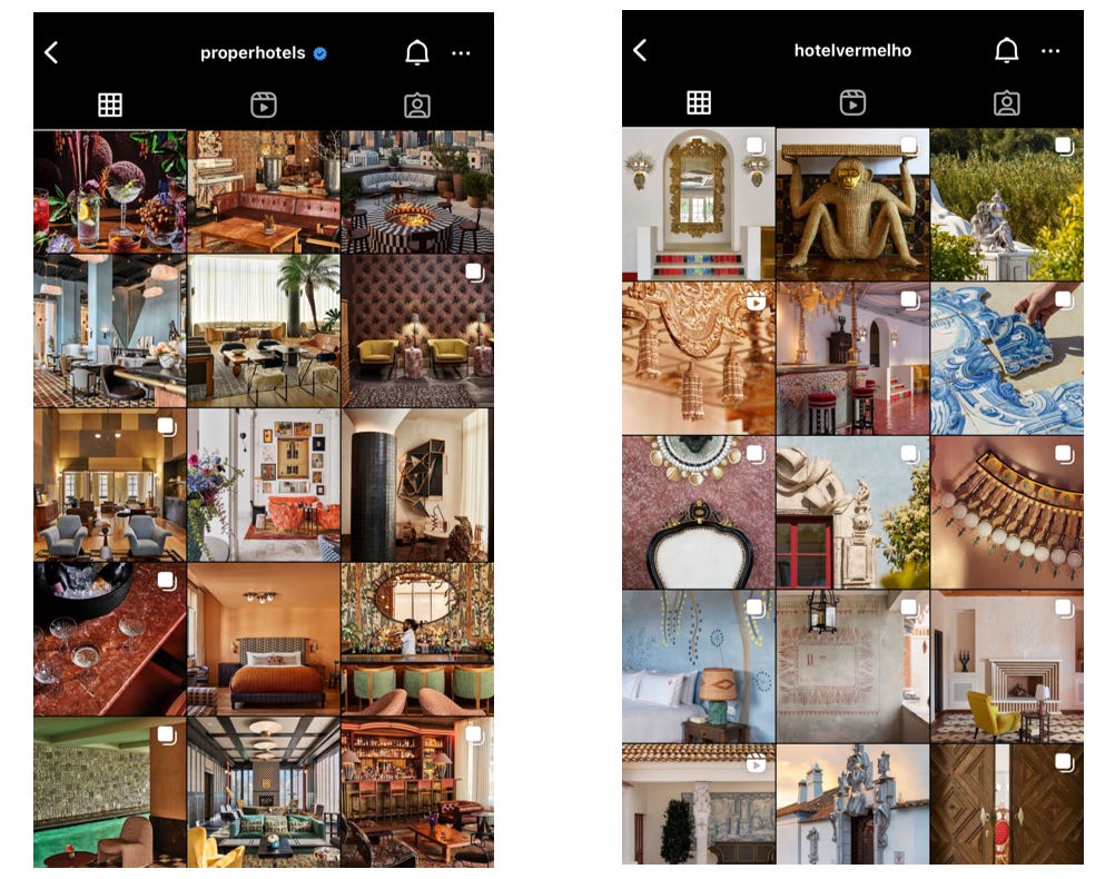
The Kelly Wearstler-directed Proper Hotels are always applauded for their design (did you guys see GQ’s Most Stylish Hotels on the Planet list?), but I find their social content overwhelming. Hotel Vermelho in Portugal (Christian Louboutin's first hotel), on the other hand, is just as luxe in design, but their social content is presented in a much more digestible format. It zooms in and out to vary perspective and alternates the use of colorful solid space with intricate patterns.
One more? Firmdale’s Crosby Street Hotel is an 86-key SoHo classic with its signature use of colorfully-printed textiles and wallpaper. While this works in the physical hotel because each explosion of color and print is contained in separate rooms, it clashes in grid format. El Fenn Hotel in Marrakech, however, is just as vibrant, but the team seems pretty thoughtful about color-blocking their grid posts. The section below feels tied together with green hues and then transitions to red tones if you scroll further down. So you still feel the vibrancy of the hotel without feeling attacked by it. See?
Ok that’s it for now! Feel free to send me any and all hotels that are inspiring you, or share this post with any other hotel lovers in your life.
— Postscript —
Recent reading that relates to some of my earlier posts:
Re: no. 6 on virtual closets & sustainability —
of shared the cost per wear of every article of clothing she bought in 2023 here.Re: no. 8 on restaurant loyalty wars — Bilt, a loyalty program that lets consumers earn rewards for paying their rent, was just valued at $3.1 billion. It plans to use the $200mm General Catalyst-led round to expand their Neighborhood Rewards program, which credits members for spending at restaurants and other local merchants. So very much like what Blackbird is trying to do but without requiring consumers to embrace crypto. Spicy.
Re: no. 5 on restaurant pop-ups + the data gap between experiences and reservation-based dining — I first read about Tock’s new “bookable experiences” feature via
last Wednesday. And then on Thursday I got an instagram ad from OpenTable to “create and sell dining experiences.” I’ll share more about my dinner with The Lineup soon, but they’re coincidentally partnered with OpenTable for booking. Anyway, seems like res platforms are finally catching onto how important and informative experiences can be to engaging diners!Re: no. 1 on identifying trends vs movements — I’ve spent a lot of the past year studying the evolution of discovery and the impact of the algorithm. I’ve wanted to write about this for a while, but it’s always felt like too big of a topic to cover in a single post. Now that Kyle Chayka has written Filterworld (which I read, and you can also get the sparknotes version of in this Ezra Klein podcast), I’m feeling like maybe I should just start with a little something something? Stay tuned.


Thank you so much for reading and for sharing Expedite! I appreciate it (and remain equally curious and excited about this "experiences" situation.)